Rebranding Boundless as an AI inference company
Summary
Boundless was expanding into AI inference, helping startups run open models, and its old brand no longer matched the product, audience, or ambition. In 30 days, I defined the company's belief system, positioning, and messaging, then led the visual identity and creative system that brought the new direction to life. The work gave the team a clear story and a practical way to express it across launches, sales, and everyday marketing.
- The new position gave AI builders a clear reason to choose Boundless based on control, performance, and cost
- I created the company narrative, messaging system, and visual identity in 30 days
- The reusable creative system lets a small team carry the brand consistently across launches, sales, and everyday marketing
Why the brand needed to change
Technical founders are trained to distrust things they cannot measure, and brand tends to fall near the top of that list.
I understand the instinct. A product benchmark gives you a number. Brand gives you a presentation full of adjectives and a promise that the work will compound over the next few years. Somewhere around the third slide about archetypes, it can start to feel like corporate astrology.
Your company’s reputation is your brand, and branding is the process of packaging that reputation and ensuring that your company is perceived for the work it does, instead of being defined by external market forces. Investing in brand gives you control over this narrative.
Boundless had recently expanded into AI. This changed our product, our audience, and our ambition, which meant the old identity no longer sent the right signal about the company we were building. The rebrand forced us to answer a more fundamental question: what do we want people to understand about Boundless?
From positioning to a visual brief
The new brand needed to make the company legible and recognizable. I built a hierarchy connecting Boundless’s ambition to a clear category, technical mechanism, and builder outcome. It gave the team a shared structure for company, product, and campaign communications while defining the qualities the visual identity needed to carry.
| Layer | Decision | Role |
|---|---|---|
| Mission | Rewriting the economics of intelligence | Set the company’s long-term ambition |
| Brand belief | Intelligence belongs to builders | Define the worldview behind the company |
| Category | Inference platform for open-weight models | Make the product immediately legible |
| Mechanism | Start with the workload, then optimize the model and serving stack around it | Ground the position in technical substance |
| Builder outcome | More freedom over what can run, scale, and get built | Connect infrastructure choices to builder agency |
Together, these decisions pointed toward a brand that should feel independent, technically credible, and expansive. The next challenge was making those qualities visible.
Defining the visual identity
The AI landscape currently sits across a wide visual spectrum. On one end are warmer, more humanist brands using natural imagery and approachable language. On the other are highly technical, developer-coded brands built around dark interfaces, dense diagrams, and the general atmosphere of a terminal window.
Both can work. Where a company should sit depends on its audience and where it operates in the stack. For Boundless, neither extreme felt complete. We wanted to feel sophisticated, editorial, intelligent, and scientific, while still having enough warmth and range to create something culturally interesting.
Finding that middle ground took a few attempts.
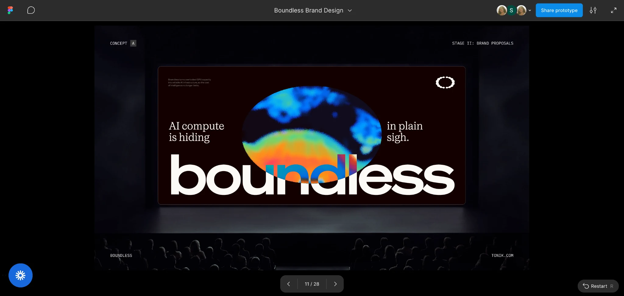
First exploration: Too extreme and performance-driven
Our first creative directions pushed hard toward the scientific and high-performance end of the spectrum. We explored thermal imagery, saturated color, and a darker, more forceful visual language. It had plenty of energy, but the strongest association was somewhere between a sports performance brand and Predator vision. It felt intense, but it lacked the sophistication and warmth we wanted Boundless to have.
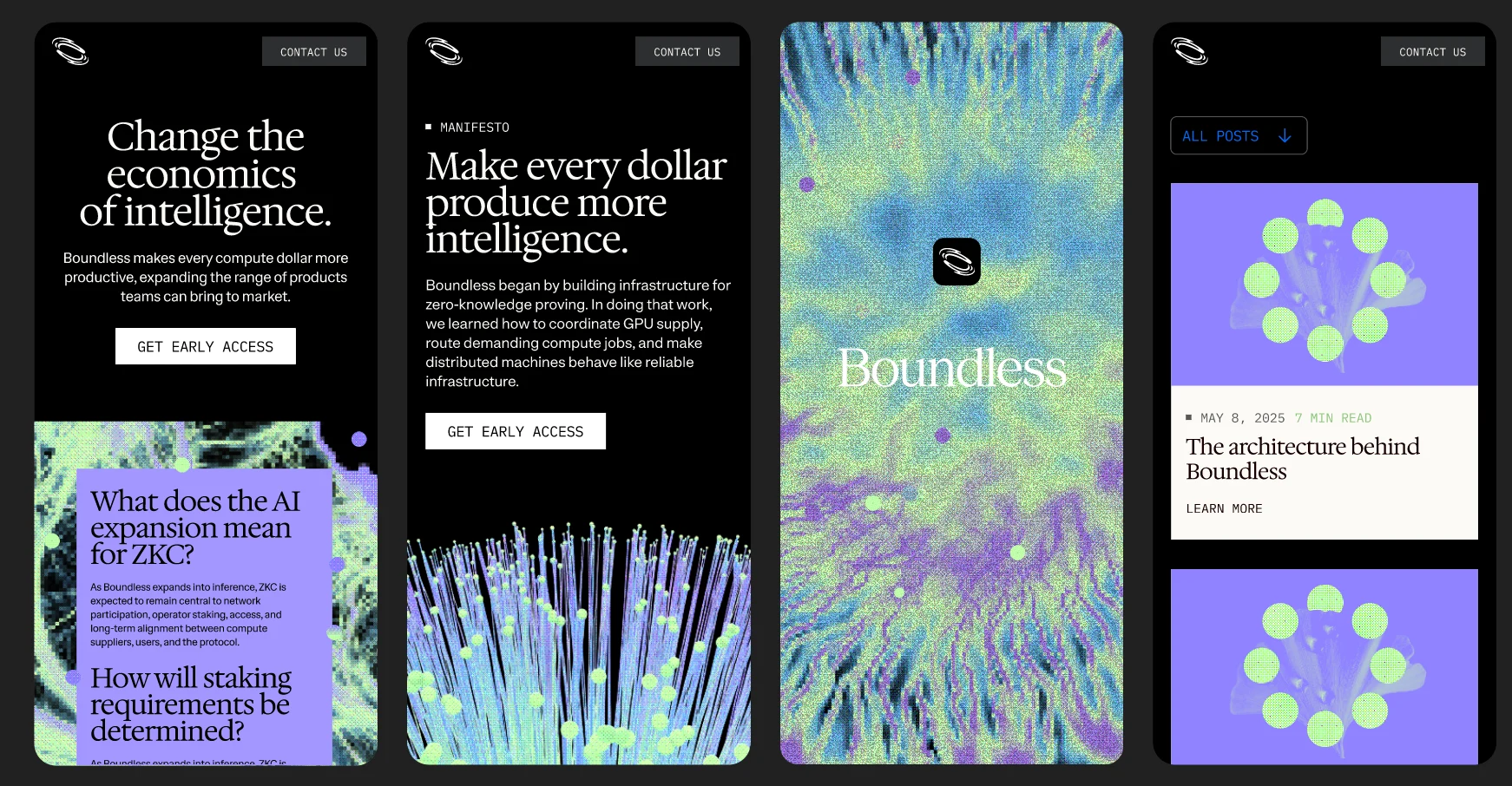
Second exploration: Too literal and too dark
To correct for that, we introduced more natural symbolism. We explored blooming organisms, mycelium, and other forms that suggested intelligence, adaptation, and continuous expansion. This brought us closer to the underlying idea, but the imagery became too scientific and literal. Some of it felt like we were looking through a microscope at the contents of a petri dish.
The wider visual system also felt too dark. Black gave the work contrast and confidence, but it dominated the palette, leaving little room for the warmth and approachability we wanted the brand to have.
There were still elements of that direction we liked. The dither gave the imagery a computational texture and connected it to our developer roots. The sense of movement and expansion also felt right for Boundless. We wanted to preserve both while moving away from imagery that looked like a specific organism and a palette that felt cold.
Final direction: Warmer, more abstract, still precise
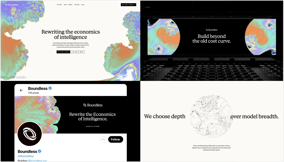
The final direction came together when we made the natural forms more abstract and brought warmer colors into both the imagery and the wider palette. The forms still feel alive and continuously in motion, but they leave more room for interpretation. The warmer gradient, editorial typography, and more disciplined compositions introduced the sophistication and humanity we had been missing, while the dither preserved a sense of technical precision.
The final identity needed to feel natural and computational, warm and precise, expressive and editorial. It can feel expansive without becoming psychedelic, and technical without becoming cold or overly developer-coded.
Building a flexible design system
More importantly, the resulting identity can flex. The lighter palette gives us room to feel more human for community and cultural moments, while black remains available when product or infrastructure storytelling calls for a more technical expression.
That flexibility matters because a brand has to work far beyond a launch deck. Throughout the process, I kept imagining the identity on a homepage, a billboard, event signage, merch, product surfaces, and all the less glamorous formats that marketing teams actually have to produce every week.
Thinking through those applications helped us evaluate whether a direction could become a real system, rather than simply looking good in a presentation.
A creative system built to scale
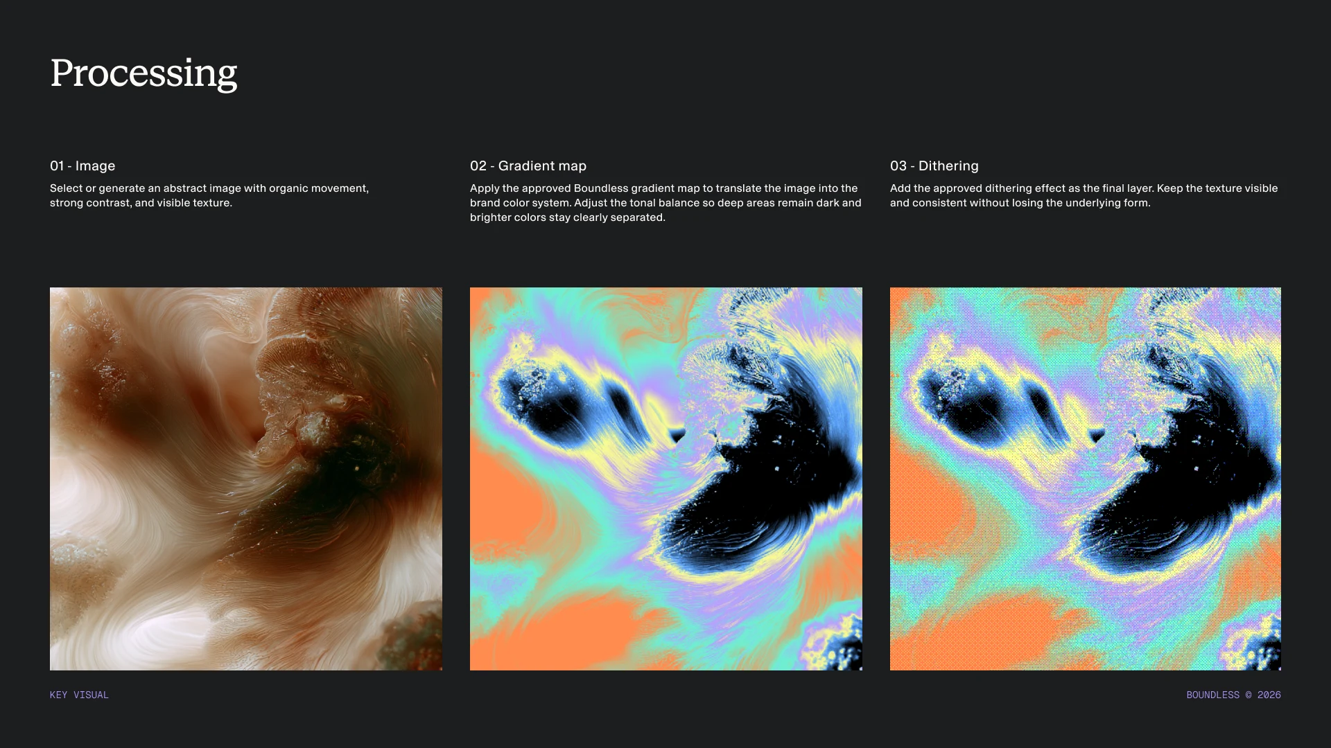
One other constraint I wanted the new identity to solve was creative scale. Our previous system relied on bespoke 3D glass assets, which became difficult to reproduce across campaigns and channels. Every new asset required a fairly involved production process, which limited how quickly the marketing team could move.
For the new identity, we built a repeatable workflow around three stages: generating or selecting an abstract organic form, applying the approved gradient map, and adding the dither as the final layer. The settings and rules behind each stage can be preserved, which means the full processing workflow can be automated rather than recreated manually every time.
That matters even more in the age of AI. A small team should be able to generate a much larger volume of creative without lowering the quality bar or slowly drifting away from the brand. Automation gives us speed because the judgment has already been encoded into the system.
Evolving the Boundless logo
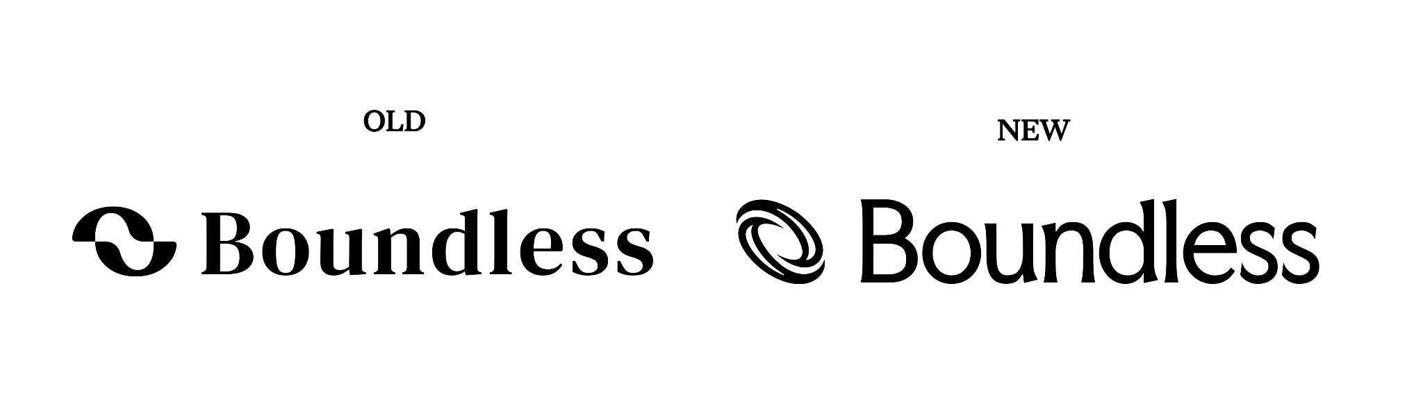
The previous Boundless mark was built around the idea of removing limits, represented by an ‘O’ pulled into two halves. We wanted the new mark to feel like an evolution of that idea, while reflecting the direction the company is moving toward.
The new mark turns those two halves into a continuous loop. It preserves a connection to where Boundless came from while expressing motion, reorganization, and expansion. The logo is only one part of the identity, but it creates a useful thread between the old and new company.
Start with what your company stands for
The biggest lesson I would offer founders is to begin brand work with an opinionated stance on what the company stands for, the change it exists to create, and how it should be perceived. Those decisions give the visual work something meaningful to express.
Looking at the most visible companies in your category and assembling a collage of their best parts will usually produce something polished and strangely anonymous. References can help map the territory, but they cannot define your mission or decide the place you want to occupy in the market.
Founders should be deeply involved in those questions before the work moves into colors, typography, or imagery. Your belief, mission, and positioning create the foundation. The visual identity then turns that foundation into something people can recognize and remember.
Brand is one of the ways a company differentiates itself, just like its product, technology, or point of view. Founders should be deeply involved because the decisions extend well beyond aesthetics. They shape what the company stands for, who it hopes to attract, and how people understand it before they ever use the product.
This identity marks a new chapter for Boundless. Huge credit to the team at Tonik and to Teresa for helping bring it to life.